 |
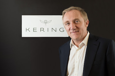
| François-Henri Pinault, PPR chairman and CEO, poses with the company's new name and logo, which is expected to become official on June 18. |
French holding group, PPR, said Friday that it will change its name and brand messaging to reflect its new identity as an international luxury, sports and lifestyle organization.
On June 18, subject to board approval, the new name for the company will be Kering (pronounced Caring). The Paris-based company said the new name reflects its culture of “taking care of our brands, people, stakeholders and the environment.” The suffix “ing” expresses the idea of movement, reflecting the diverse history of the 50-year-old company, which began as a trader of timber and construction materials. The stem “ker,” meaning home in Breton, refers to its origins in the Brittany region of France.
Since 2005, PPR has been undergoing a transformation from a conglomerate focused on primarily European distribution activities, to an international group focused on the apparel and accessories business across two fast growing segments that it defines as “Luxury” and “Sport & Lifestyle.” In a few months, the new group expects to leave the distribution sector completely, after disposing of Fnac and the remainder of online fashion retailer Redcats.
The company’s collection of brands include Gucci, Bottega Veneta, Saint Laurent, Alexander McQueen, Balenciaga, Brioni, Christopher Kane, Stella McCartney, Boucheron, Girard-Perregaux, Qeelin, Puma, Volcom, Cobra, Electric and Tretorn.
Laurent Claquin, head of PPR Americas, said the change in the company’s identity is a natural step in the group’s transformation.
“We are marking a transition from a conglomerate to an integrated group,” he said. “We are in the business of fashion. We are also part of the same group (as) a way to signify how we do our business with our brands and customers.”
Claquin refused to comment on published reports that the company is in the final stages of acquiring luxury Italian jewelry brand, Pomellato. “It is not the subject of the day,” he said.
Accompanying the new name are new symbols for the company and an international branding strategy over multiple platforms that it emphasis the creativity of its brands. A new video, website and advertising campaign and supporting items are among the ways the company intends to promote its new image. Digital media will be a centerpiece of the campaign. Follow this link to view the company's new video.
As part of the strategy, the company adopted a new symbol, the “untamed” owl, and even a company signature that reads: “empowering imagination.”
The owl is drawn from a single line, like a quick sketch, a doodle even, with outstretched wings and its face framed in a heart. This simple drawing expresses far reaching values, according to the company, from foresight, wisdom and intelligence to caring and respect.
Claquin emphasized that the new campaign is geared toward the B-2-B community and not the general public. “We don’t communicate through a general public,” he said. “We don’t want to be stronger than our brands but we do communicate to our target populations.”
Please join me on the Jewelry News Network Facebook Page, on Twitter @JewelryNewsNet and on the Forbes Website.
No comments:
Post a Comment